random art thoughts
art improvement memes
i filled out this decade of art template.
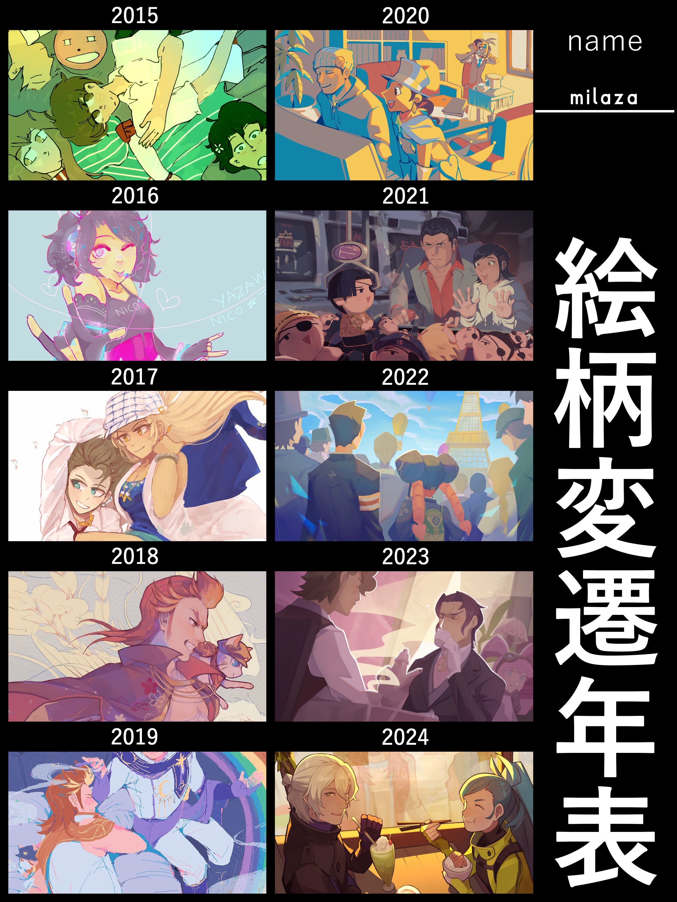
usually i hate doing these things because from the outside it looks like i just peaked in 2018 when i was fucking 16 years old. but i've finally been able to combine my 'serious' art style with my love for drawing backgrounds and detailed scenes so i think my artwork looks impressive again. 1
that being said, i still think my previous thoughts on the topic were valid. art improvement memes aren't necessarily a good way to judge your artwork if it's purely on aesthetics alone. you can get much faster at drawing over the years while staying at the same 'skill level' aesthetically but that's not going to be shown in a single illustration you use to represent a year's worth of art. you can practice drawing muscles all year and your best drawing of 2023 might be a guy in a winter coat. or you might be someone like me where i fell behind on drawing 'serious' 'rendered' artwork in favor of doing full scenes where there's less individual detail but more interesting story and composition overall.
a lot of that was because i just didn't have the energy to do both 'serious' characters and full backgrounds at the same time, but i think i've finally gotten good enough at it that i can do so. 2 plus, i somehow became decent at three point perspective last year despite only drawing genderbent van zieks porno. good composition also doesn't need to include scenery-style backgrounds to begin with, though much of my own art of that ilk tends to be in a wildly different style so i didn't include them here.
i wonder if the art improvement meme is something you eventually let go of once you're so good that you have no visible improvement too. i always feel self-conscious of posting artwork from 2021 or older because it feels kinda crappy if i haven't improved that much in three years. but kazuya nuri's out here still reposting art he did for apollo justice back in 2007. i don't know how i'd feel once i reach that point. happy because i'm so good that i can still be proud of my art from 15+ years ago? or sad because i was already so good back then that i don't feel ashamed of it at all? 3
looking at it now though, i'm wrong to even call this an art improvement meme to begin with. 変遷 just means change or transition without any implication of improving. that objective way of looking at things feels much better.
how i'd describe my art style
i've always described my style as 爽 (shuǎng).
this hanzi has many meanings, but i mean it in the context of eating a crisp (爽) peach, one that's solid and makes a nice sound when you bite into it. i think that represents my colors— my strongest point— well. they're bright and vibrant yet not pastel nor neon, just colorful and crisp. 4
i think it's refreshing (爽) in shape too. someone recently said the shapes i use are like a wave, with sharp angles and swoops and i really liked that description! i think my style leans pretty realistic and cool as far as animeshit goes, so adding in wave-like shapes helps it look much more cartoony and fun.

frieren sketch and some commissions for friends online (jeramie brasieri from ohsama sentai king-ohger and cowboy kun from wayv).
overall i'm finally really happy with where my artwork is at, though i want to try drawing more sharp, detailed, and darker art with more patternwork in the future. i can't help that i love drawing bright and colorful and fun things though!
i'm bad at helping with what i'm best at
i think i'm usually pretty good at helping other people with their artwork, but colors are difficult to me despite them being my strongest point— or rather because they are. colors are everything that make or break an image but they're also the most distinctive part of most peoples' art styles IMO. like you can have an instagram account where the shape and line style are different every time, but as long as the colors are consistent it'll look cohesive. that can't be said for the other way around.
anyway, this is just to say that i don't know how to help with pastel or neon artwork outside of general color cohesion. because it's like, a whole other ballpark of aesthetic appreciation. if it were up to me, i'd darken the colors here and desaturate them here, etc. but the person i want to help is someone who likes those bright neon colors and many others do too. i just don't have the same personal appreciation of that palette to be able to assist with it in the same way i can assist with anatomy or background perspective.
this was also drawn before i started locking in and getting way better, but i haven't had the chance to draw another big illustration that i can post publicly yet.↩
it's hard to do it at a bigger scale though. i'm still trying to figure out how to draw detailed characters in large compositions without making them look like paper cutouts.↩
AJ is genuinely one of the most aesthetically-appealing games ever to me so i am not knocking the GOAT nuri at all (TBH i even like AJ art way more than DGS). i'm just trying to think from the perspective of an artist who's been around that long at all! maybe it's something you don't care about once you are that good LMAO.↩
apparently some people think i use soft/desaturated colors even which is kinda crazy to me NGL i think my artwork is super bright and colorful. i guess i tend to avoid the upper-right corner of the square palette out of habit since i know it won't print well lol.↩