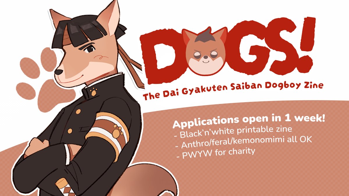
graphical glowup?
i've been really self-conscious of my poor graphic design skill lately... it's not something i put effort into and as a result i haven't improved in years and all my graphics tend to look the same. which isn't an issue when all you do is promote anime art events, but still.
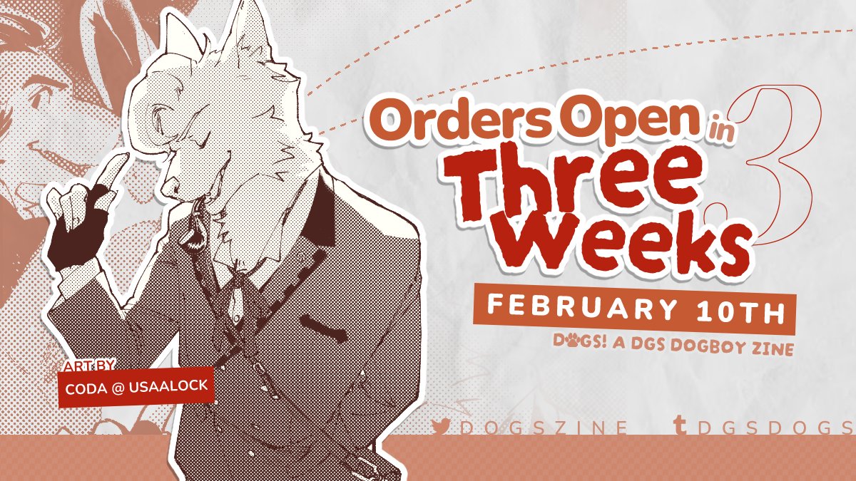
i finally set a new order open date for my dogboy zine and decided to give it a graphical overhaul at the same time. the structure is still largely the same (not much you can do when again, this is to promote anime art events), but i think it feels like an upgraded version of the old design... my copy of photoshop got blocked by adobe police so i'm back to using CSP.
this time, i'm featuring the artwork by the participants rather than my own promotional art. since the zine is in black/white, i tried to make the illustration stand out more by applying a grey, paper-textured background. in addition to the main drawing, i included a snippet of the rest of the image in the background. i feel like it looks good with the screentone effect of the drawings.
typographically, i stuck to using variations of darumadrop one and nunito, which are the google fonts i'm using on the website. i tried putting in more variance to the text to make it feel more engaging, but i worry that it takes up too much focus or is unclear compared to my old design format. the old design also emphasized the title of the zine rather than the function of the graphic.
i'm planning to make these promotional graphics much more personalized than my past graphics where i just slap an image onto a preset template, so i still have a lot of room to tweak the layout if this isn't as successful as i hope. i'm not sure how to feel about it TBH; i think it's most visually appealing and interesting for sure, but it kinda gives 2011 forum signature rather than an informational, clear reminder.